Every once in a while, I have occasionally, accidentally, been given the task of improving other people's graphic designs, usually for larger scale social events within the educational sphere, often after other people have failed to accomplish the task to the standards wanted. To help facilitate me getting assigned this task once more at some point in the future, here are a few examples of my abilities in gussying up a flyer or three. Maybe one day I will get to design something from scratch!
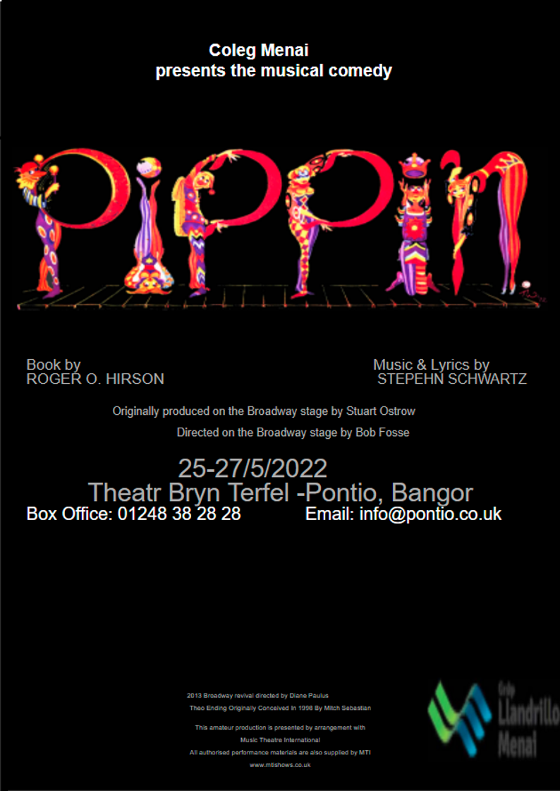
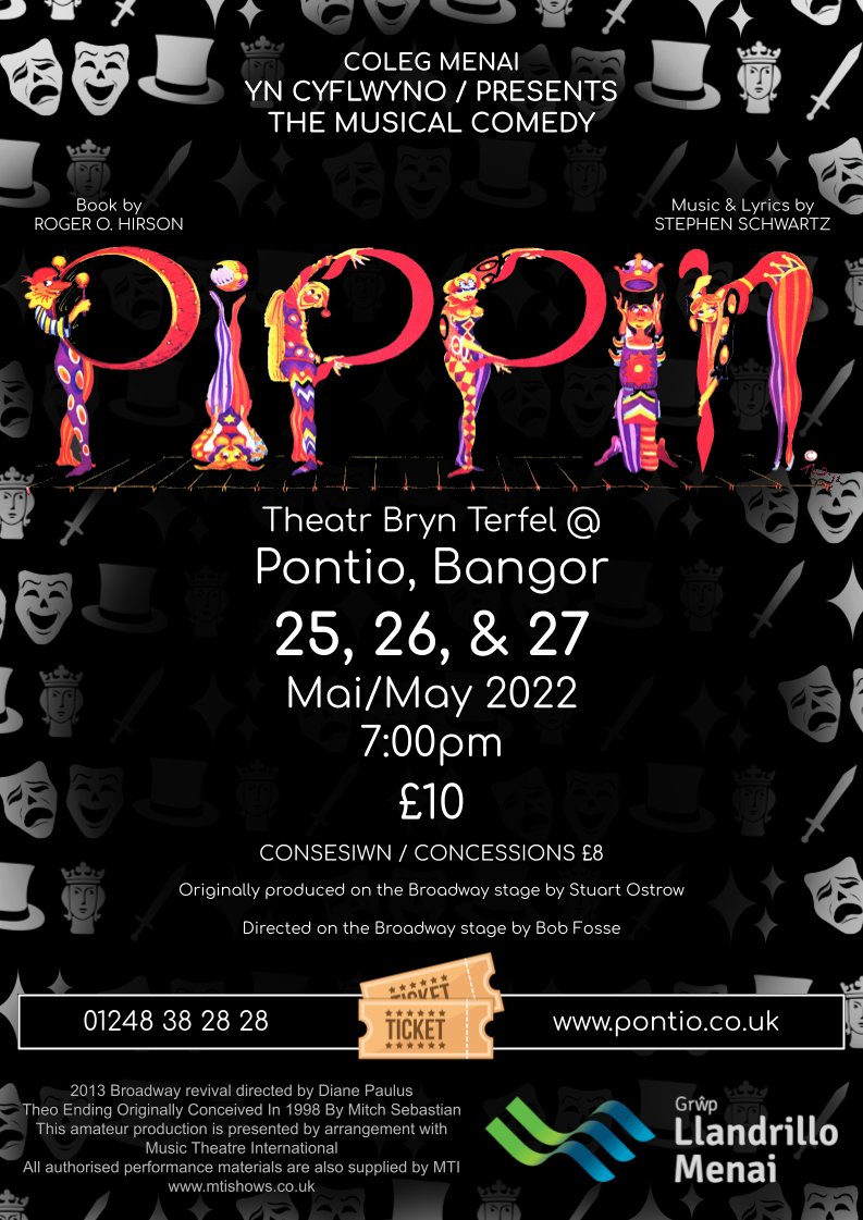
This first example from 2022 was bilingual, English and Welsh, a paid show from a sixth form college put on at Pontio Theatre. A fairly gaudy and complex version of this poster was first made by a member of tech staff at the college, using images of the cast and a colourful design; the director of the play did not like this design. The director then mocked up the above first design, highlighting the simplicity and information wanted but not quite reaching aesthetic wants. I was then brought in, and with many notes from staff members finally arrived at the design above on the right. Some of the text work I did was a little weird.
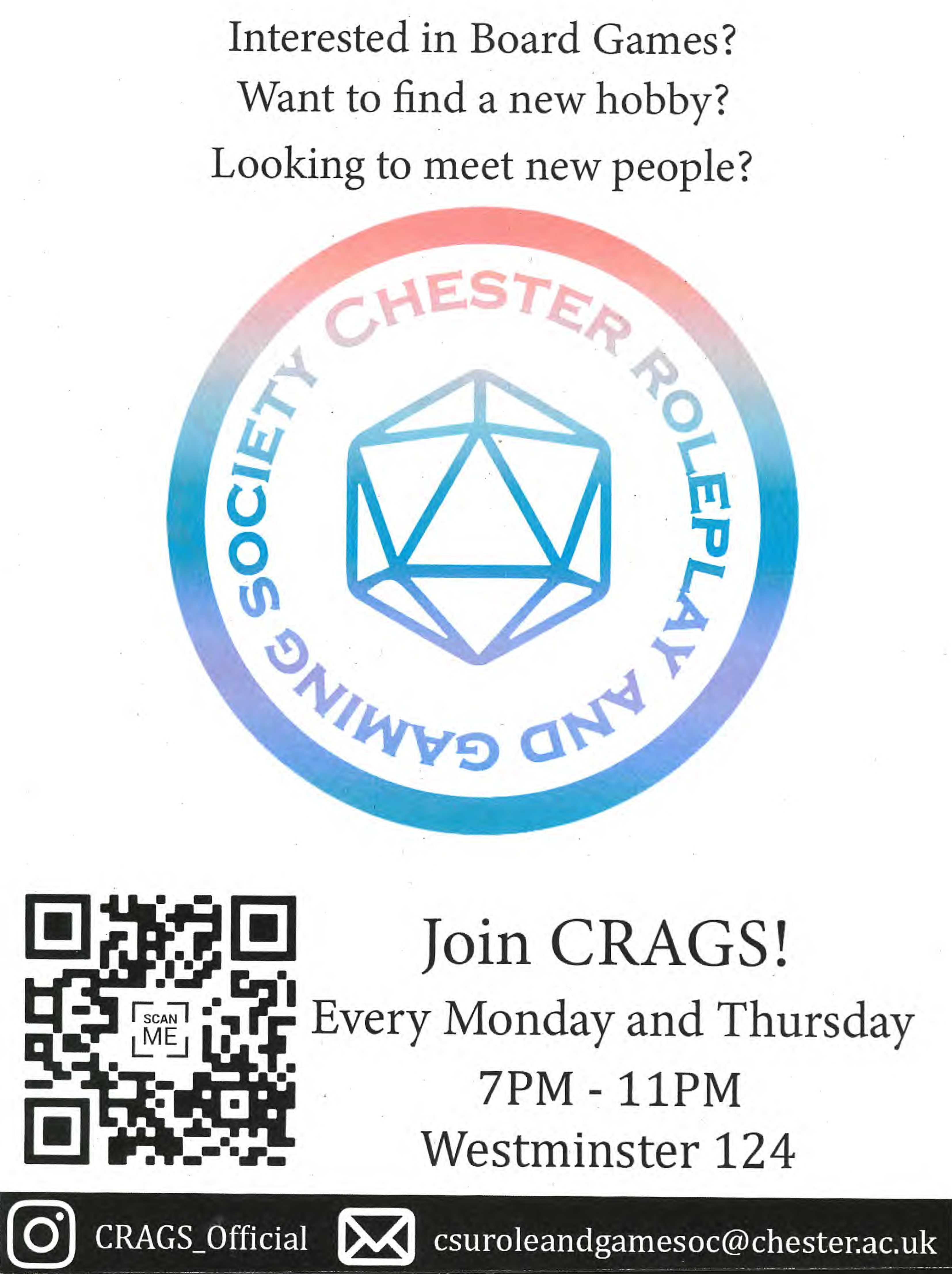
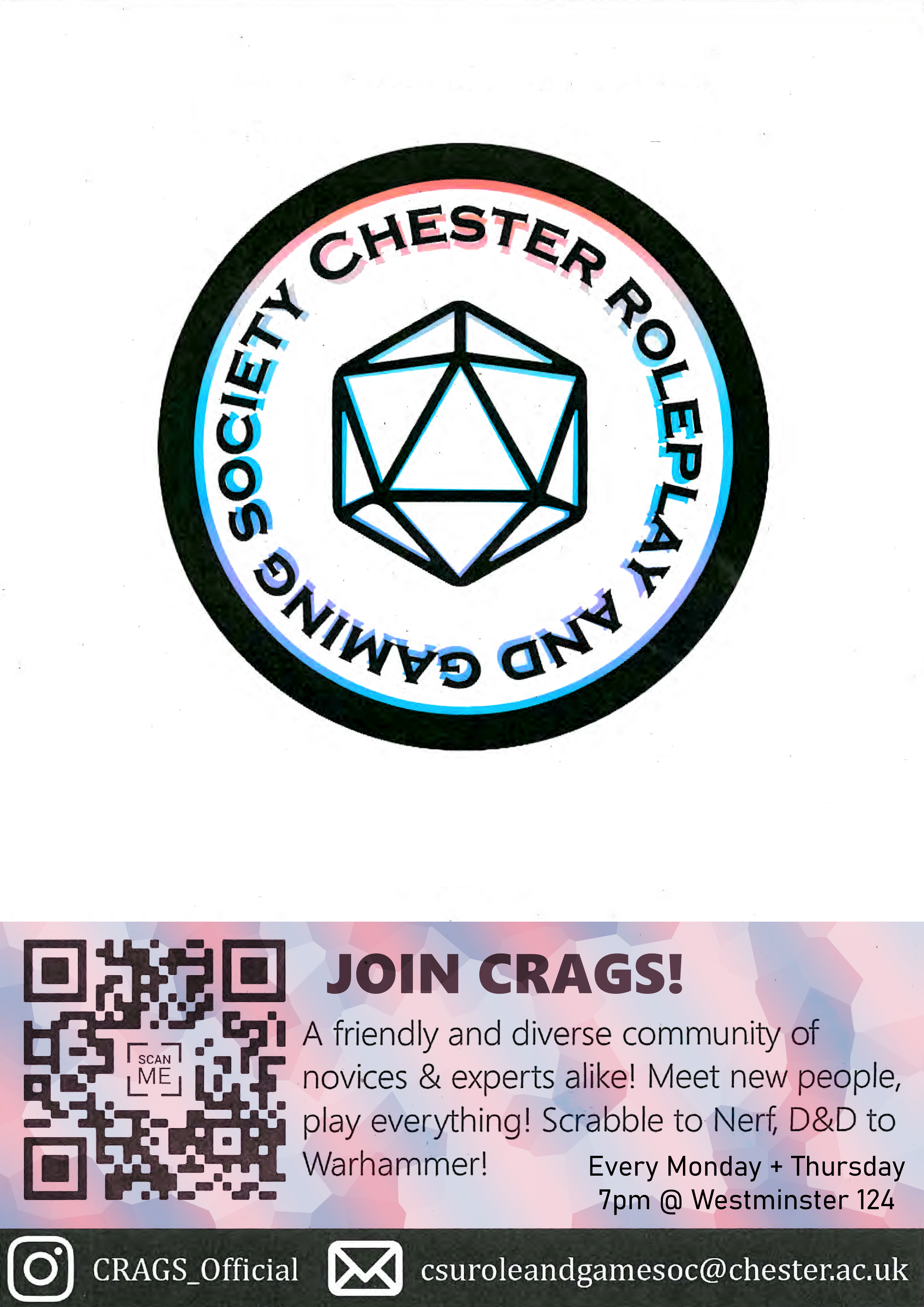
I was given almost no time to update this design before the university year began, having to scan the initial poster design myself just to receive basic assets, as the person who I was designing for failed to send me the needed materials. Many choices I made within the rush weren't my favourites in retrospect, but definitely improvements on the original, as before me the concept of 'highlight the logo through stark simplicity whilst conveying friendliness' was betrayed by clustering big unfiltered fonts around the page without structure.
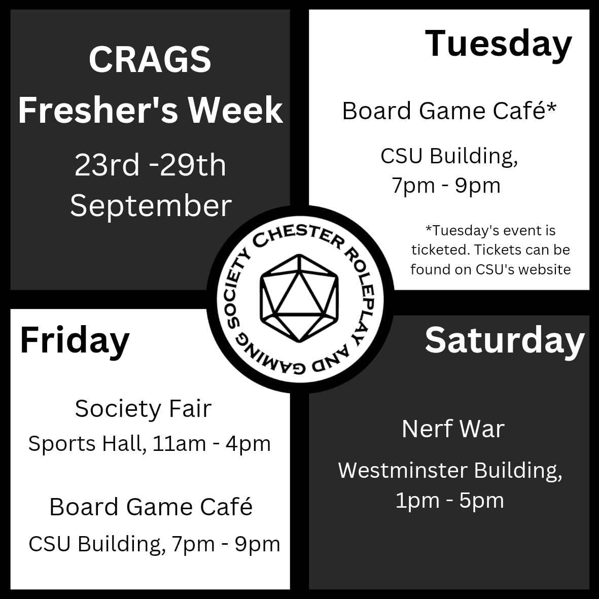
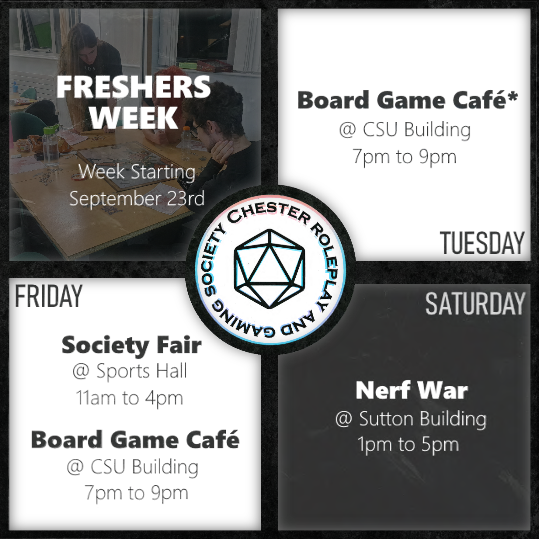
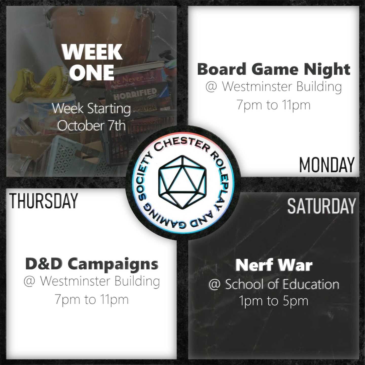
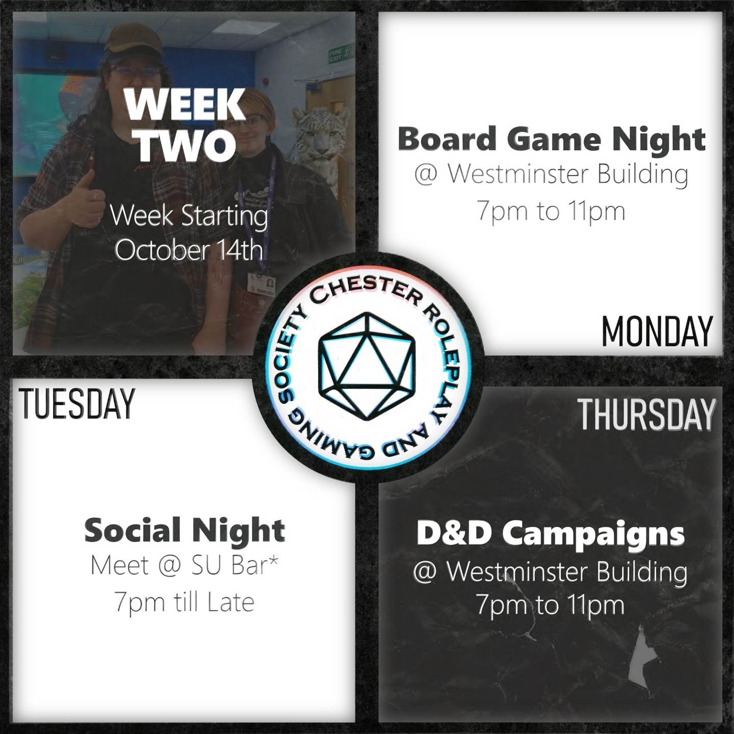
These are the improvements, mostly in detailing and basic visual hierarchy, that I made for their Instagram timetable posts; the cleanliness of the formatting got tinkered into better shape with every go, but the light-skeuomorphic concept, instead of evolving with time as planned, got diluted by the artificial rush that the client demanded I work under each week, with the detailing flanderising into a more weathered look that reflected my growing dismay, before I then left the project.
For more information about Strictly Come Dancing, visit BBC Strictly Come Dancing.